The
Lens fade fixer??
Making Panoramas can be fun – but it can
also be disappointing. If like me you use a cheap camera chances are
you'll produce some panoramas that looks like this.

Your
lens has failed you. The edges of the images can be over an f-stop
darker than the centres causing these ugly bands when you stitch it
all together. Some advise to take more photos with more overlap -
this is not good solution. Ideally you buy a better camera and start
again. But the opportunity has passed, you may never see this place
again or in such perfect weather. Let us try to salvage what we have,
it should be easy enough – I'm a hacker (not cracker) and
that's the sort of thing we do when we should be doing something
else.
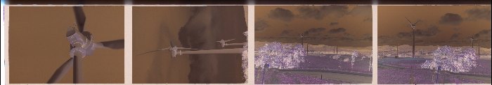
If
you have a sharp eye you will see some of the offending negatives on
the right of the strip. The centres are darker in the negatives hence
lighter on the positives. The negs on the left however look ok - this
is because they were taken with the zoom lens in a telephoto mode.
The fade varies with focal-length, aperture, contrast and the phase
of the moon. If you are unable to lock the aperture setting then the
amount of fade may vary within a panorama series. "The internet"
says that the fade is related to the fourth power of the cosine of
the ray angle, maybe it's true but I don't believe it.
So learned
how to access BMP files (and later PNG,JPG and TIF) and wrote some
code. Processing every pixel, computing it's distance from the middle
and applying a correction is not that hard but you do need to
un-gamma correct the bitmap and such. I found a simple x^2 curve
worked best for my ricoh-rz115 photo but a x^3 worked better for my
older camera (the reef photos).
But there was a snag – color
cross-over! In tech terms the d-log-e (density/log exposure) curves
are slightly (or not so slightly) different for the 3 color emulsions
on the film. In lay terms the dark parts of the photo will have one
color and the light parts the compliment. For example sunny bits
might have a green cast and shadows magenta. Its fairly common and
usually its not to offensive. What this means it that the edge of the
photo is not only darker but its also a different color! In my test
photos this was mainly a yellow/blue cross-over with the edges
tending towards blue. I tried to ignore it but the keyboard called me
and I wrote some more code. Not knowing exactly what the film curves
looked like I could only do a crude color correction.
This
is a stitch of two images. The top one has a dark band in the middle,
the bottom one has had "the treatment". I think I've made
an improvement - the banding is much reduced and the color x-over not
too noticeable. My biggest problem is getting consistent scans from
my scanner/software – this might be my next adventure. The left
side is has more yellow/green but this is in the original scan.

The
program is intended to batch process a series of images in a series
but this will only work if images have the same amount of fading etc.
Sometime the image will need to be processed one at the time. Before
doing any batch processing you load an image and try to make it
write. This is done to working out the parameters for the batch job.
It is worth noting that the fading is easier to see in a small image
and making the preview images larger would actually make it harder to
set the adjustments.
The "curve" options let you choose
how exposure correction is applied. If only the extreme edges are
dark you'd use a x^4 curve. If the fade is very gradual you'd try
linear. So far sqr (x^2) and x^3 have worked the best for me but your
milage may vary.
Moving the "Fade compensation" sliders
should move the graph is real time and also correct the right hand
image. In the graph "up" is lighter and the green
horizontal line is neutral (no correction). It is a linear scale.
It
is nearly impossible to know what the image gamma really is –
play with it until it looks the best. Mainly you are looking for
uniform contrast across the image. The controls tend to interact
somewhat.
As stated earlier the color x-over correction is fairly
crude. Avoid moving the controls to far left because you will ruin
your blacks. Essentially you are changing the contrast of the three
colors independently and the overall contrast will be change to some
extent.
Beta 1.1 is here. if you want to play. It
is a windows program (sorry about that). It has been run on win2000
and NT4 and I'd expect it will work on 95 and 98 and (heavens forbid)
win-XP. It is written in delphi-5. My PC is a 950 athlon with 128K of
RAM and 40G of disk. Older machines may struggle. You don't have to
installed anything but you need to put the .ddl file where the
program can find it (such as in the same directory).
There
will be bugs – report them here.
There are some know
issues which I will probably fix sometime.
The output filename
generation needs to be a bit smarter so it doesn't append a count
when a only single file is processed. It could also be taught to skip
filenames which are already used.
The only TIF files supported are
24bit uncompressed.
The "check update" feature is a bit experimental.
For the (rightly) paranoid all it does is load a small text file from
this website onto your drive – if the version number is newer
it tries to download the new zip for you. It does not run it. It does
not send anything out on the net expect the file requests. However it
is a little disturbing how easily something nasty could be hidden
inside a program like this – it pays to run a (free) firewall
in any case.
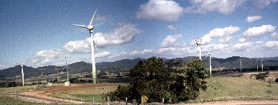
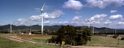
My Panoramas
My
HomePage